
My 4 year old daughter is learning her alphabets. Yes, plural. She is learning the Thai alphabet at the same time. It’s amusing to see her singing along to the rhymes devised to aid rote memory, and hearing her la, la, la, through the middle bit.
But it has got me to thinking on why in this day and age; the alphabet is still being presented in such an arbitrary and illogical format.
I mean: Why ABCDEFGHIJKLMNOPQRSTUVWXYZ, when QWERTYUIOPASDFGHJKLZXCVBNM makes more sense?
When children get onto the reading/writing stage, the characters are all mixed up differently anyway, so the order of the letters in the alphabet makes no difference.
I don’t recall any songs or rhymes from when I learned the alphabet. We children slavishly copied the letters using a stick of chalk to scribble onto a black painted board the same size as an iPad. Yes, that was in the 1950s, not 1850s, though paper was still in short supply.
The Alphabet letters were pasted on the walls in 4 panels around the classroom. I still visualise the alphabet broken down in those 4 parts. A-H on the chimney breast/I-L in the alcove/M-R to the left of the window, and the rest on the right.
When I wrote longhand, I never thought of alphabet. Now on the keyboard, I wish I was taught QWERTY. Q-P on the chimney breast, A-L in the alcove, and Z-M on the wall to my right.
Still, too late for me and maybe also for you, so let us now think of future generations. If I was inclined, I’d go back to college and return with degrees, so my theory will garner respect. As it is, all I can do is ask you to think about what I say and not dismiss me as crackpot. I say: Teach our children QWERTY. Split the alphabet in two blocks; a left hand block and a right one.
And hope it doesn’t take them 60 years to ask, “Why?’
While on the subject, I’d like to make two more points.
I’ve noticed that most alphabet books are in fact written by professors with a list of degrees following their names longer than the word count inside. Why? The job should be given to a graphic designer. They are far more qualified to produce an alphabet book.
For a start: The typeface should closely follow the style of hand written words, i.e. one based on Century Gothic Sans Serif. I have a copy of an alphabet book that some smart arse professor had printed in Cooper Black. Why? The shapes of the letters look nothing like they should.
EXAMPLE:
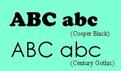
Same language, same letters, different shapes:
Which typeface makes more sense to use?
Which typeface makes more sense to use?
Secondly: Illustrate the book with images found in the 21st century. I mean, T for Top. What kid today is familiar with a top? If Professor Knob must illustrate D with a Desk, then for Pete’s sake don’t draw a hole for an inkwell, and grooves to rest pens.
I’m flipping through such a piece of tripe now. U for Uncle with a picture of a paedophile, H for Hen; any kid knows the picture is a chicken. Q for Quilt? I for Ink? The date of publication is 2008. Even back then kids didn’t use ink or have quilts. I give up. I’m going to produce an alphabet book that makes sense.
Watch this space.
 RSS Feed
